Neobanks have been making waves for quite some time. And it is clear by now that the hype is not just about offering better bank UI UX compared with the traditional banks but a lot more. People might think that Neobanks UI UX is like the new cool kids in college, showing off all the latest gadgets and cars to woo the crowd. But, this couldn’t be farther from reality.
Neobanks offer the latest tech and banking functionalities to customers. They often want to sound funny, quirky, and arrogant, but it is part of their brand play. They go to great lengths to provide the best customer service and experience.
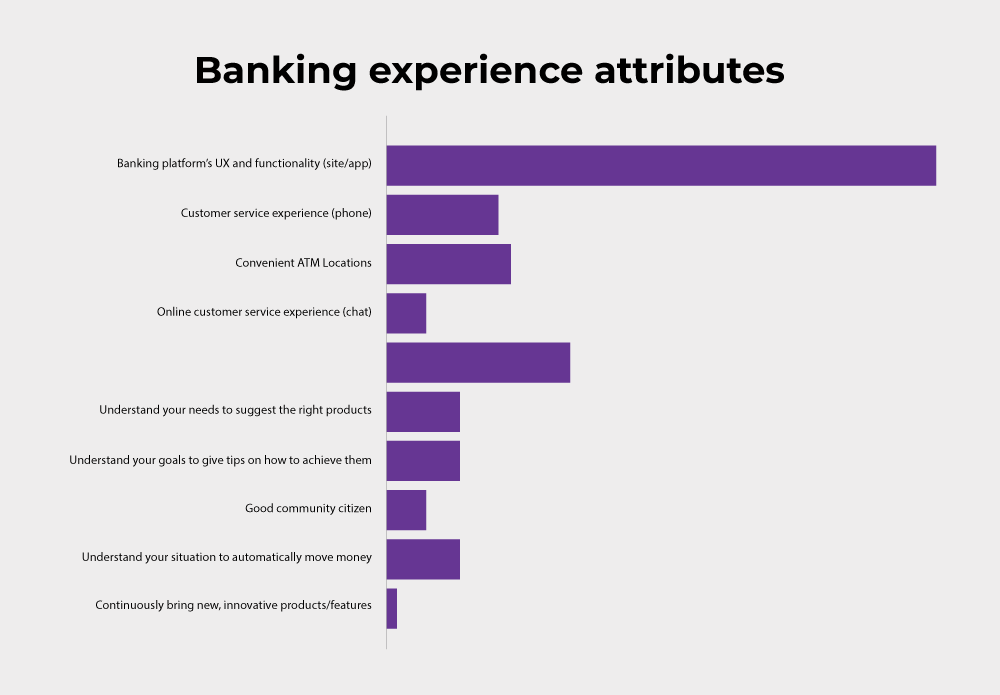
The neobanks want to look fantastic and perform even better than they look. They give great importance to how the UI looks and how frictionless the customer experience can be. According to the Digital Banking Pulse Report, consumers are three times more likely to cite digital banking experience than customer service experiences and convenient branch and ATM locations as the most critical aspects of banking.
In this two-part blog, we will explore the possibilities of what great UI/UX does for a neobank and establish the fact that neobanks are more than just good looks!
UI/UX: the new CX for neobanks
The Neobank category is fast-growing and is no more a hidden fact. Global tech market advisory firm ABI Research predicts that the top 57 neo and challenger banks worldwide could amass several million more users in the next few years — potentially with a significant jump from 155 million in 2020 to 590.6 million in 2026.
The question now remains – why this sudden surge? The answer is that this surge was already evident in 2015-2020. It is just that the pandemic gave the much-required push to customers to look for digital-only financial solutions.
“The increased demand for digital solutions during the pandemic has stimulated investors’ interest in neobanks and increased their visibility to target markets, onboarding new customers looking for compelling digital offerings” – Sam Gazeley, Digital Security Analyst at ABI.
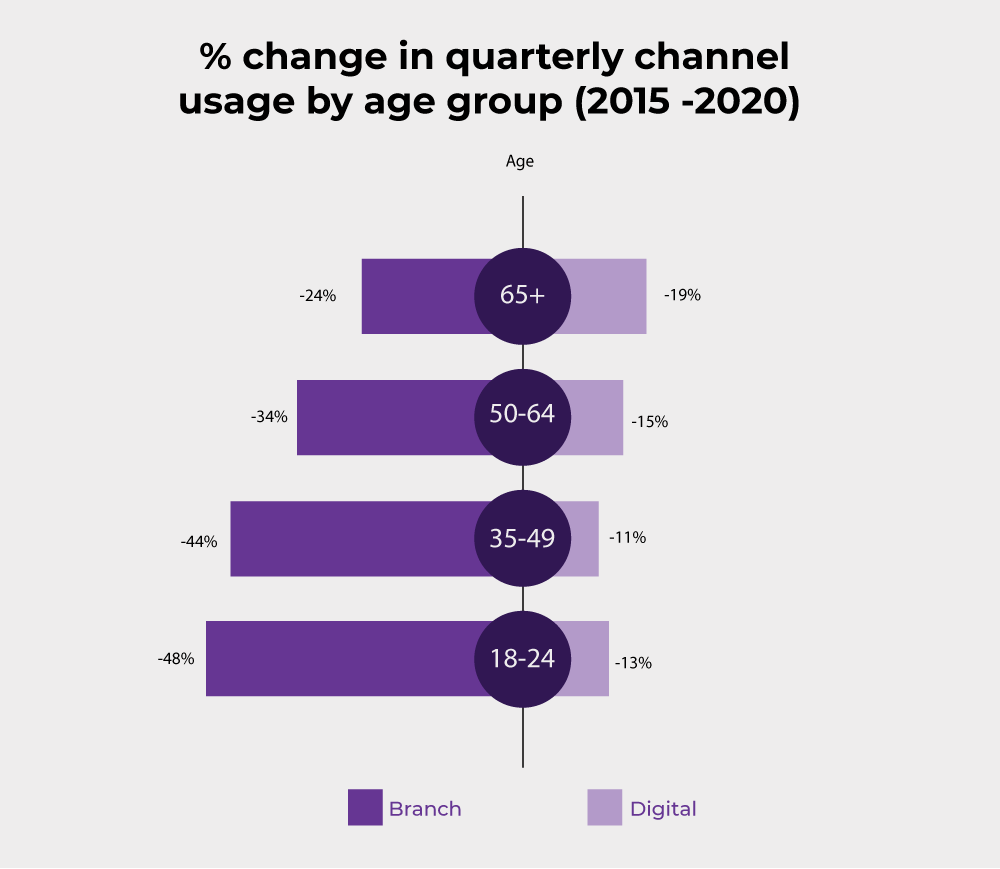
Before the pandemic, different age groups of customers showed an inclination towards digital banking. Even though they found that there is little to no difference between the basic functionalities of traditional banks vs. digital banks, they were attracted to digital banking because:
- Seamless customer onboarding: They never had to wait in a queue to open a banking account. With biometrics technology, identity verifications were fast and hassle-free.
- Real-time notifications: Customers were notified about the success or failure of transactions in real-time. They do not need to go back to the bank or wait till the end of the day for a transaction status message.
- Integrated management tools: Dashboard and visualization tools gave a complete overview of the finances.
- Goal Setting: Gamification of the banking app allowed for goal setting that motivated customers to save and improve their financial condition.
- Budgeting: This feature allows consumers to understand their spending patterns.
- Advanced adaptive security: The level of security changes based on what task a customer is performing in the account. It makes the banking application more secure and user-friendly.
When customers saw these benefits, one thing became clear; the neobanks are working for them. Unlike many banks previously, neobanks are not forcefully selling features but are focused on providing the best customer experience. Some neobanks dug deeper and offered targeted, tailored solutions to their customers. However, these features will be for naught if they are not represented to the customer properly.
Best practices for designing UI/UX for banks
All the features and offerings from neobanks look great. But, most customers, be it individual or business, will bounce off if banks don’t involve themselves deeply in designing the UI that is synonymous with their brand and offer the best user experience. They will be unlikely to return if they don’t receive a great customer experience.
Therefore, here are the best practices one can leverage while designing UI/UX for banks:
1. Effortless authorization
As more and more neobanks evolved, biometric authentication became a convenient and effortless option to access banking services. Customers already expect access to groundbreaking authentication systems from their financial service providers.
Users want to access the banking app easily and fast. Irrespective of urgent bill payment, quick balance check, or hurried money transfer, pace and ease are mandatory for an ideal banking customer experience where every second counts.
Biometrics has advanced quite a bit in technology that provides instant access to mobile banking while maintaining high-level security. The traditional way of authentication with complex passwords and one-time codes will likely become memories of the past for a modern, user-friendly financial app.
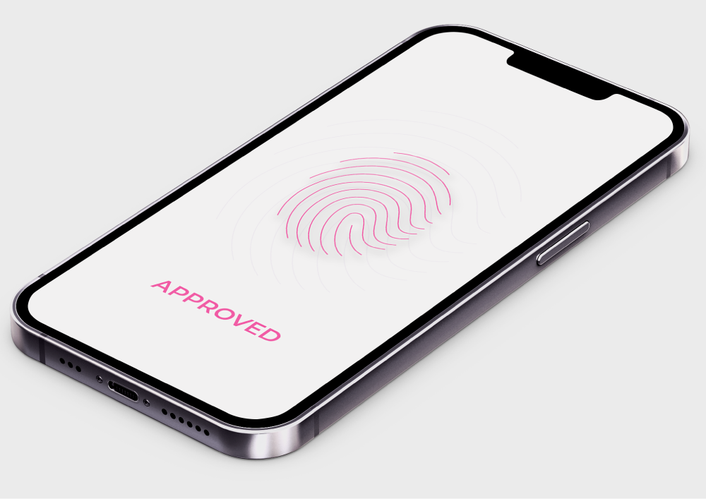
Neobank UI UX for Authorization with Biometrics
A banking app can use multi-factor login security solutions to maximize security. Use biometrics for an effortless and quick login (TouchID or FaceID/ VoiceID). Additional authorization for more sensitive banking functions (security settings, changing limits, etc.) and large monetary transactions should be present.
2. Ensure important information is always at the user’s fingertips
The financial status of the account is the first thing a customer would like to see instantly after logging into the application.
Here, users want to see their money without the credit limit or reserved amount in their account. The banking dashboard of a bank should be easy to understand. It should display the user’s overall account balance and demonstrate the money movement in the account and the latest financial notifications. The goal should be to spotlight critical data and preserve a minimalist visual style for transparency and ease of use.
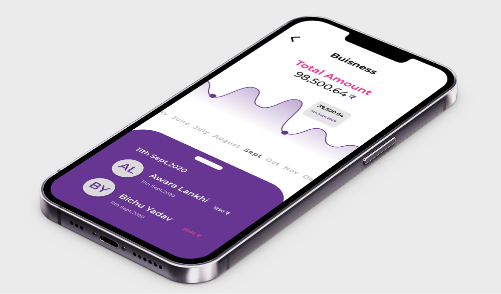
The main dashboard
It is also essential to consider a scenario where the user manages multiple accounts and the business budget. The customer would want to see each account’s status and the overall financial status of the business. A bank UX design should offer an easy and intuitive way to switch between the bank accounts with as simple as a swipe, while the balance chart should be designed to make it easy for the consumer to assess transactions in each bank account.
3. In-depth financial insights at a glance
To have in-depth knowledge about their finance, customers need to know the state of their planned balance, excluding the budget for routine unplanned expenses. The Banking UI/UX should give consumers the ability to explore monthly income and expenses and also allow them to compare their average levels over a period for each account.
The bank should forecast the consumers’ account balance until the following scheduled financial income is credited by providing an instant view of how much liquidity is available.
It should be easily discoverable by clicking on the balance summary button. In this way, the consumers can quickly gauge their financial position and plan their expenses accordingly.
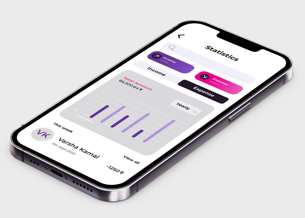
Neobank UI UX for Income and expenses overview
In the above style of UI, the user only needs to pull up the account data card to reach the account menu. The card locks, and the menu appear at the bottom. Customers can apply for financial support through an overdraft or pre-approved loans. Everything the user needs is just a few clicks away.
It should be convenient and quick to add funds to the account and download an e-statement. Customers can also effortlessly edit the account name, configuration, and status.
4. Deliver valuable insights on spending
The balance chart in the banking app should be designed to provide valuable information at a glance.
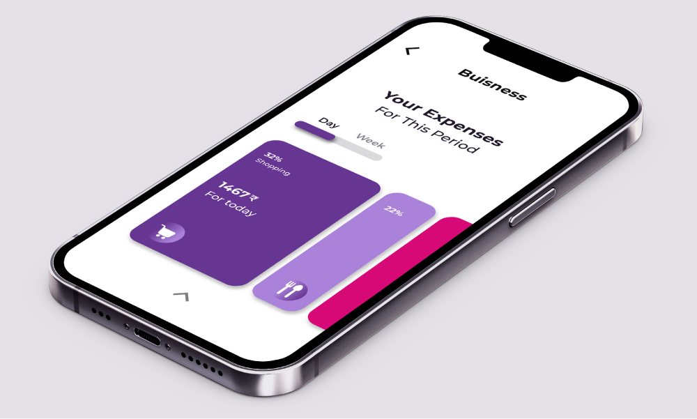 Neobank UI UX for Spending insights
The bank app should show the user’s balance and forecast the near future. It is convenient for the customers to be aware of their finances through the ability to explore paid, unpaid and scheduled bills easily at a budget level. The customer can gain instant insight into their highest categorical spending by clicking on the chart.
A bank UX should take it further by providing recommendations on potential savings generated through its native AI.
The customer should discover more spending insights by pulling up the card, setting a budget and goals, and paying the bills. It will most likely deliver delightful experiences to customers through the digital banking interface.
5. Design the best banking UX irrespective of the type of account
Customers often handle multiple accounts of various kinds, such as fixed/recurring deposit accounts, credit accounts, loan accounts, investment accounts, etc. A sound banking app should aim to provide a delightful banking customer experience irrespective of the type of any customer’s account and make it easy to review, monitor, and manage finances.

Neobank UI UX for Account Overview
A banking app should connect all types of financial accounts from different banks to crypto wallets so that businesses can get comprehensive insights into their actual monetary wealth in a single interface.
The banking AI should determine a given client’s preferred investment strategies and make recommendations based on the inferences from the banking AI, even adding new investment avenues to help the businesses to accelerate specific financial goals.
6. Represent financial activity inspired by social media
Social media platforms have set up a high standard for customer engagement. Banking apps can very well take inspiration from them. What if the banking apps could represent the banking transactions as an activity feed rather than the old-school style representation like a sheet of numbers.
Transaction history is the second most important thing a customer checks after looking into the balance. Customers should get more value from it than just seeing the recent transactions history that lacks insights.
So, what if banks offer a timeline that allows the customer to look into all transactional information effortlessly, suggestions from friends, system-generated recommendations, and notifications clearly and more simply like a social media feed. A familiar UI puts users at ease and helps integrate the banking solution into customers’ social space.
The social aspect shouldn’t restrict itself to looks only. The banking app activity feed can also display customers’ opinions about the bank’s financial services and products and other social-based product recommendations. It can also include advice and service tips to improve the customer’s financial situation. According to the nudge theory, context-based suggestions created using banking AI, powered by predictive analytics based on big data, can provide a great customer experience.
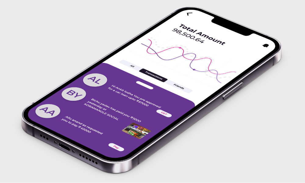
All of a user’s financial information in a timeline inspired by social networks
Recommendations should include anything far and in between to enhance the customer’s financial health, such as:
- tips to regulate spending in the most money spent category
- notifications on urgent economic activities
- recommendations on savings and investments based on customer goals;
- reminders for routine bills and payments;
- useful contextual messages, like the location of nearby ATMs when traveling;
- spending alerts when visiting shops

For an intuitive banking user experience, banks can place the transactions list under the accounts screen and link it with the balance chart. So that, when moving the chart, a customer can see all transactions within a particular timeline.
7. Ensure all transactions information is in one place
Make detailed information on each transaction available with a single click. The banking app dashboard should conveniently display all the details about a transaction, such as the beneficiary, amount, category, and geographic location. The banking app design should simplify splitting bills, exchanging money, and sending reminders to beneficiaries.
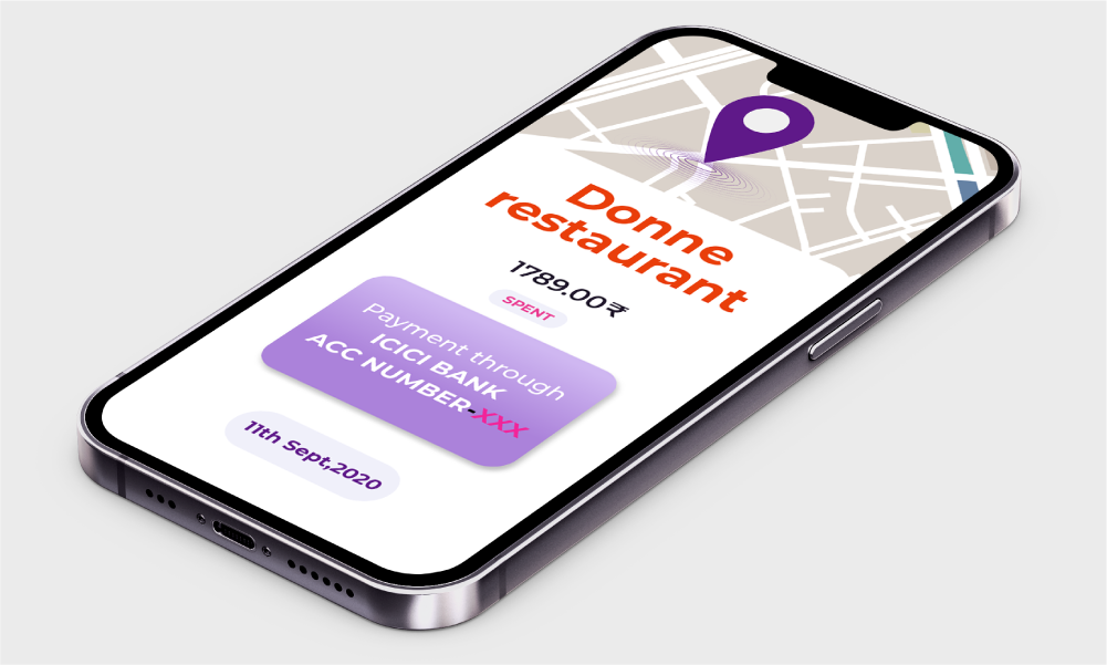
Neobank UI UX for Transaction Detail
Customers should be able to sort related transactions, categorize transactions, and report suspicious activity in the account instantly.
8. Provide payments faster than Instant Messaging
Money transfers and bill payments are among the top priorities of the digital banking customer experience. Unfortunately, they are also causing friction with the users, as fine-tuning these features for a fabulous customer experience takes time and effort.
Many traditional players have already started acting on it. They have started adopting the neobank-like experience for instant payments and resolving payment requests. We all have experienced the long payment forms of the era bygone, with several input fields that still causes headache to the users and still exists in some banks.
What if it took ages to exchange messages with our friends on IM platforms? It would be as if we traveled back when digital technology was non-existent, and everyone exchanged letters. So, there is no good reason for customers to suffer and wait for ages to complete monetary transactions with their beneficiaries.
Many challenger banks have found ways to tackle it. Users can send money in seconds, without commissions, regardless of a bank account. Many banks still struggle to implement this. Money transfers and bill payments should be effortless.
The bank should design its banking app to make these options easily accessible from the main menu. Intelligent contact mapping utilizing the core banking database, social network channels, and contact directory on the phone should compile a single list of contacts for optimum banking user experience.
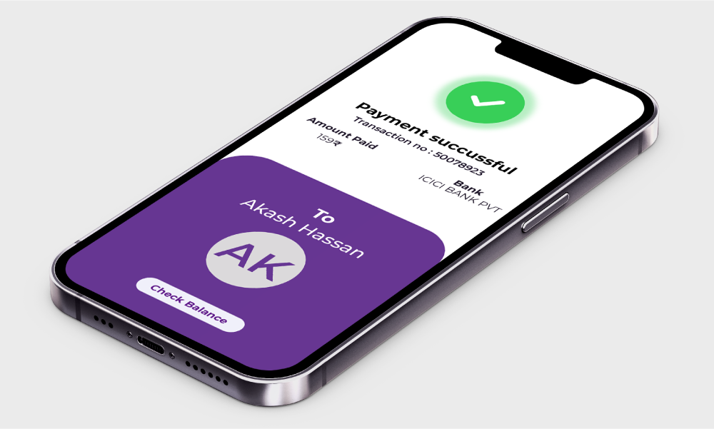
Neobank UI UX for Instant payments
In this way, the customer would be able to search for beneficiaries in the contact list using any attributes such as name, e-mail, phone number, account number, and transfer money through a preferred channel with a button in seconds.
After a successful transaction, the recipient’s card and account number should be added to the contact list automatically if it doesn’t exist.
A banking app interface should be designed to offer a full range of financial transfer capabilities, such as:
- P2P payments;
- bill payments;
- auto payments;
- international transfers with currency exchange and payment requests.
These transfers should be clicks away and take minimal time and effort.
The banking platform should offer security, transparency, convenience, and high-speed payments leveraging the capabilities of the blockchain network and the adoption of PSD2 analogs for exceptional customer experience.
9. Let the bills take care of themselves
Think of a system where customers can leverage financial AI settings to prepare or pay bills automatically. The banking app should offer customers the opportunity to add recurring payments to feeds and disburse them with a single tap.
The periodic payments should be displayed on the financial chart, and their payment status marked with a specific color. It would make it easy for the customer to remember and make timely payments.

Neobank UI UX for Paying a bill
The hidden fees make an unpleasant customer experience. Doing away with the hidden costs should be a way ahead for the banks. If necessary, the banks should inform the customers and display the hidden fees on the payment card.
10. Create a mobile banking app you can talk to
Customers expect things to be fast and effortless in the digital age. A banking app should offer the ability to perform any task instantaneously or self-help with digital banking AI voice assistant service support.
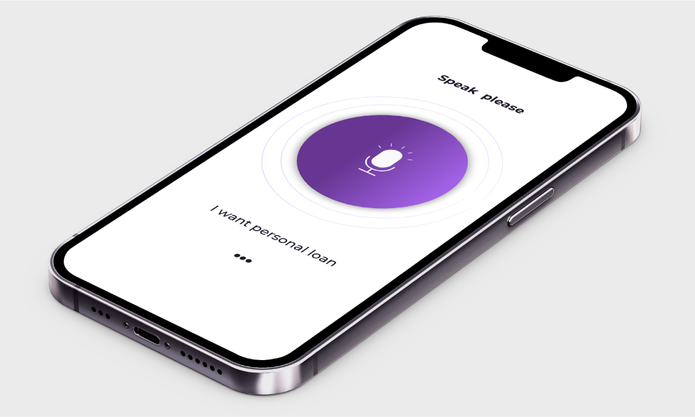
Neobank UI UX for AI voice assistant.
Customers can request a money transfer and find the nearest ATM to get it done instantly. Banks can reinvent the banking user experience and include a financial assistant to save customers time and effort.
Conversational banking can integrate with the Internet of Things (IoT) – for example, the banking app’s AI advisor with intelligent home assistants such as Amazon Echo or Google Home. With authorization via voice ID biometrics, a customer can check bank balance and upcoming payments and make transfers to beneficiaries.
Being proactive instead of reactive is one of the fundamental principles that future banks make AI-based voice assistants part of their customer experience strategy to offer newer services and answer queries readily.
For more best practices and a detailed framework on (Neobank CX) Customer Experience..check out part 2 of the blog.


